PAX ecommerce & email
PAX ecommerce & email
PAX ecommerce & email
PAX ecommerce & email
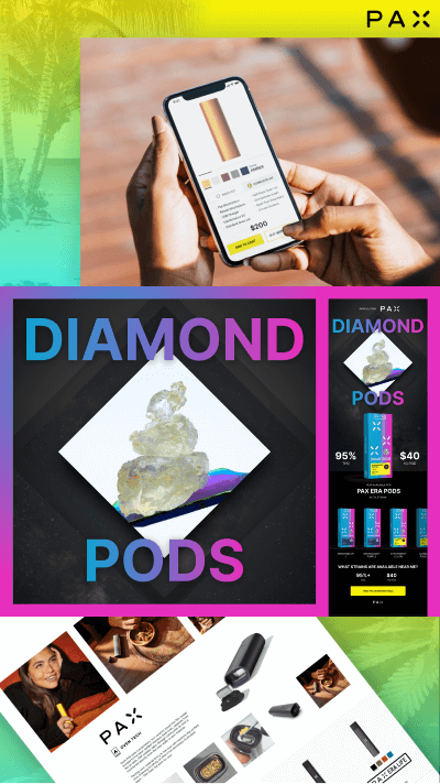
Explore an evolved design of the product landing page to improve the customer experience and increase sales. Explore PAX's new product launch email to increase conversions.
Explore an evolved design of the product landing page to improve the customer experience and increase sales. Explore PAX's new product launch email to increase conversions.
Explore an evolved design of the product landing page to improve the customer experience and increase sales. Explore PAX's new product launch email to increase conversions.
Before
This is a major launch for a top-shelf product from a leading brand. We have tons of opportunities to optimize:
· customers don't want to read a paragraph of text
· the deal price is buried in the paragraph of text, we need to HIGHIGHT the deal
· instead of mentioning the quality of the product, we need to HIGHLIGHT all major benefits/features++ (THC, California flower, etc)
· the main CTA btn does not stand out
· customize the CTA with a click-through that shows results near them
After
PAX is a premium brand, so let's communicate that through compelling design and copywriting. Let's highlight the most imprtant info to the audience:
· the new product title (Diamond Pods)
· the most important product info (quality - 95% THC, price - $40, what device and where are these available - PAX Era and California, what product variations/strains are available)
· pose a question to entice the consumer
· repeat the quality and price highlights
· improve the CTA in the button
· engaging imagery and design (yes, this can be done in email)
· remove the social media icons or increase the tap target area for each. If we want to keep these icons, add a testimonial or some other social proof to make this section engaging and enticing

Product landing page
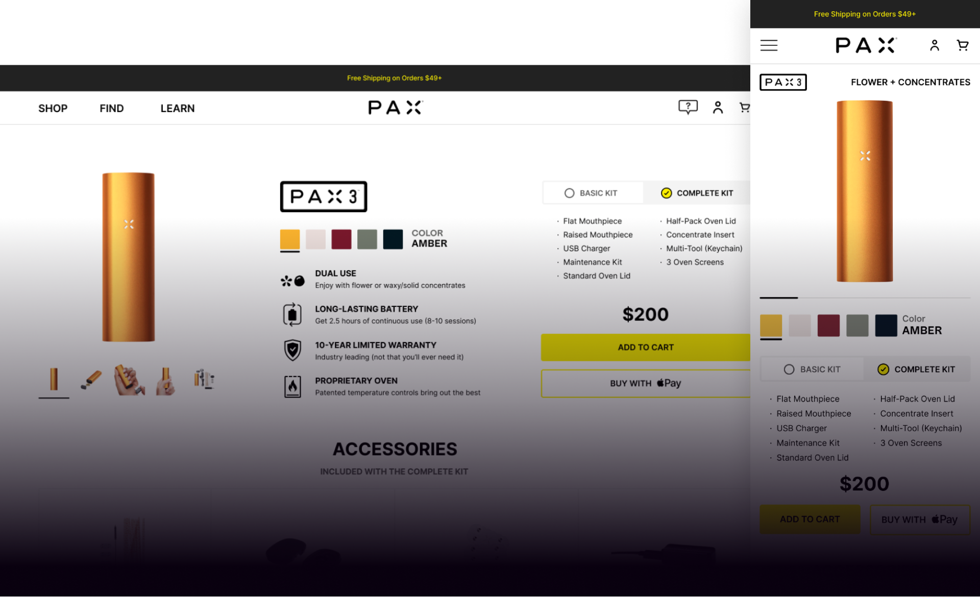
Mobile - overview section
· I'd love to analyze the data with the team to make data-driven decisions
· What is the data on the sticky sub-nav CR?
· Do we have reviews to display? (social proof)
· Let's remove the product title (PAX 3), already there
· Add KSP/usability feature: Flower + Concentrates
· Move the main product image up
· Make the image slider swipable as it is throughout most modern ecommerce (consumers are used to this)
· Remove the left/right arrows
· Add a swipe indicator bar letting the consumer know there are more photos
· Color picker: ‘Color’ in original case, because in uppercase it is competing with the actual uppercase color text (AMBER)
· Kit selector: go lighter as the current dark color feels heavy and drab
· Swap Basic/Complete, even if we want the iuser to purchase the more expensive and full kit option, the UX works better to swap them
· Keep the two columns of bullet points as is
· Move the price above Add to Cart btn
· Add browser-based 'Buy with Apple/Google'
· Move the KSPs up just below the buy btns
Oven tech section
· The blue background makes this section feel separated from the PAX 3 product. Like an advertisement or general info. Proprietary tech is badass and needs to be highlighted
· Add a swipable image carousel with thumbnails
Accessories section
· What is the data on add-on vs add to cart?
· Let's A/B test with moving the Accessories section up with the product features and info
· Swipable carousel, displaying thumbnails of each included accessory
· Recommended Add-Ons (Add to Cart)
Compare section
· Update the existing widget with Add to Cart for EACH product. Why force the browsing customer to go to the specific product page to then add it to the cart? I'd love to review the data and optimize accordingly.
Footer
· What does the data tell us about the effectiveness of having all of the links in the footer? On each product page, let's consider a minified footer, which will help keep the customer focused.
Before

After

Desktop - overview section
· Consider replacing the product title with the PAX 3 logo
· Move the product image carasoul to the left side, because consumers are used to this layout via Amazon, Shopify, most online stores
· Move the product info to the center, include the KSPs next to the product images
· Move the kit selector to the right side with the CTA buttons
· Add browser-based 'Buy with Apple/Google'
Oven tech section
· The blue background makes this section feel separated from the PAX 3 product. Like an advertisement or general info. Proprietary tech is badass and needs to be highlighted
· Add a hoverable/swipable image carousel with thumbnails
Accessories section
· What is the data on add-on vs add to cart?
· Let's A/B test with moving the Accessories section up with the product features and info
· Swipable carousel, displaying thumbnails of each included accessory
· Recommended Add-Ons (Add to Cart)
Compare section
· Add a left column with the row titles and icons
· Each row background turns white on-hover
· Add to Cart instead of only Learn More
Footer
· What does the data tell us about the effectiveness of having all of the links in the footer? On each product page, let's consider a minified footer, which will help keep the customer focused.
Before
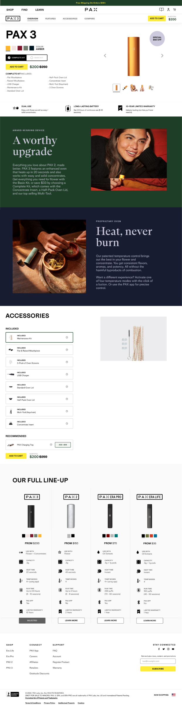
After
More Work
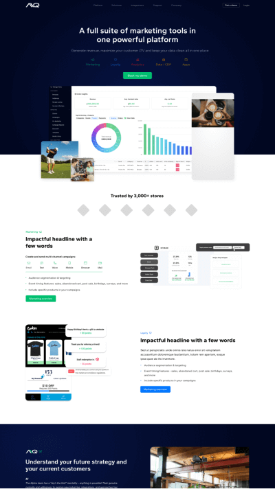
Alpine IQA cannabis industry leader, AIQ is the most powerful suite of marketing & loyalty software expanding to additional industries. SaaS product design, evolved branding, website, blog, and email.
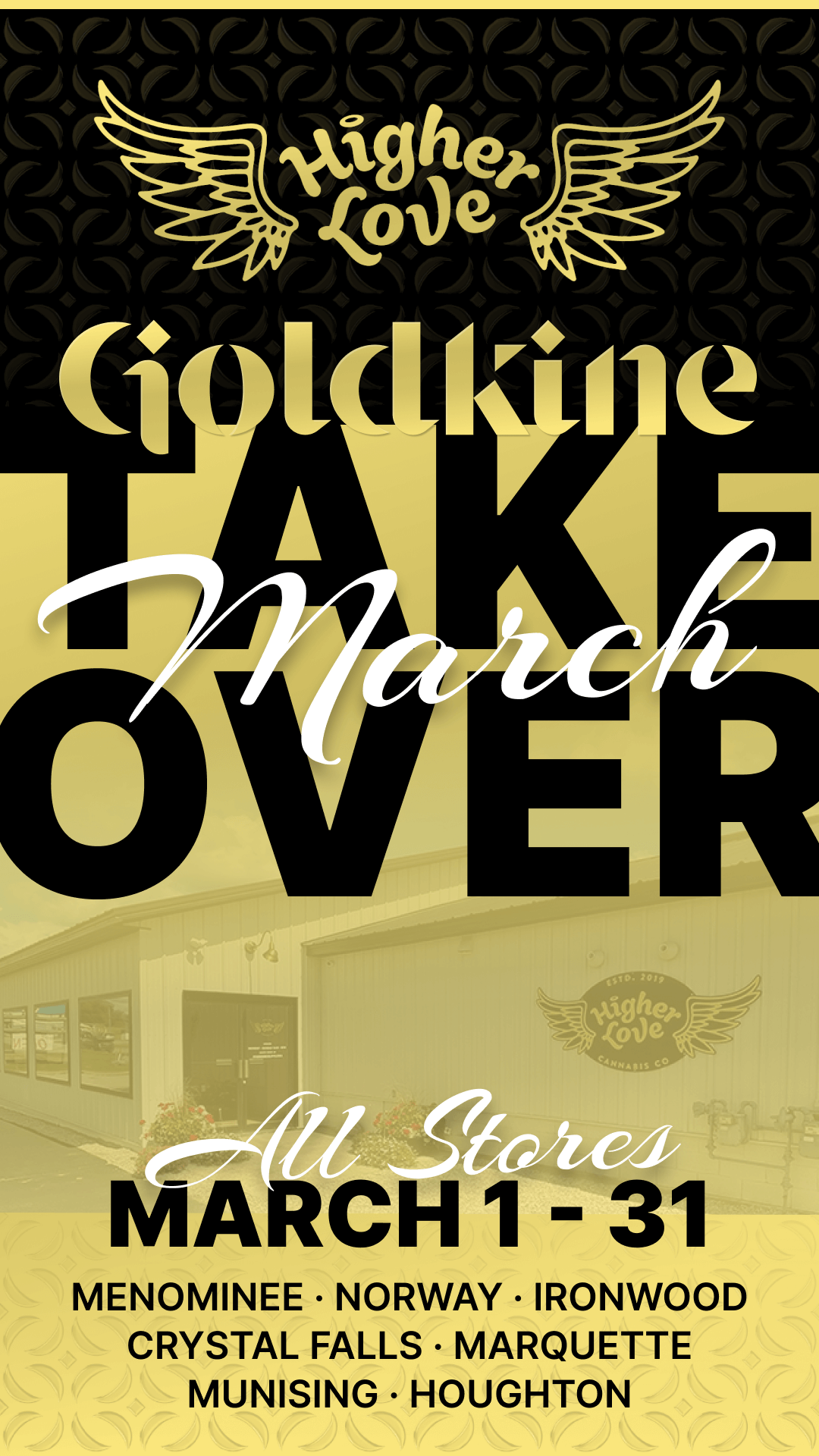
GoldkineA premium vertical cannabis brand spanning B2B wholesale and B2C retail with many products. B2B landing page, email, social.

Flourish SoftwareRobust cannabis seed to sale compliance and inventory management. SaaS Product design, B2B website.
PAXLeading pioneer in electronic cannabis consumption devices and community partnerships. B2C landing page, B2B landing page, email.

Quality RootsExploring ideas for an amazing cannabis dispensary retail chain with 8 stores in Michigan. B2C ecommerce.
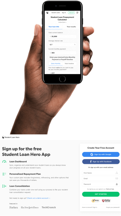
Student Loan HeroBest source of student loan info and management software (acquired by LendingTree for $60M). SaaS product design, B2C website, blog, landing pages.
Additional designsBest source of student loan info and management software (acquired by LendingTree for $60M). SaaS product design, B2C website, blog, landing pages.